Monday, October 30, 2017

Lines

Lines have many uses in a photograph. They can divide, unify, or accent certain parts of a composition. They can also lead the viewer's eyes throughout an image. 

Vertical Lines- go up and down 


Horizontal- go from left to right (or right to left)
Related image

Image result for horizontal lines photography


S Curves- curved line (similar to an S shape)
Image result for s curve photography

Related image

Leading Lines- typically straight lines that LEAD a viewer to look somewhere (usually in the center)
Related image

Image result for leading lines photography

Image result for leading lines


Pay special attention to man-made objects such  as:
  • roads
  • fences
  • boardwalks
  • bridges
  • bricks
  • anything in a row such as lamp posts
  • buildings
  • doorways
  • window panes
In nature, pay particular attention to:
  • rivers
  • shorelines
  • waves
  • sand dunes
  • trees
  • tall grass
  • cliffs
  • rocks
  • sun rays

Thursday, October 26, 2017

Framing/Cropping

Framing
The world is full of objects which make perfect natural frames, such as trees, archways and holes. By placing these around the edge of the composition you help to isolate the main subject from the outside world. The result is a more focused image which draws your eye naturally to the main point of interest.


Cropping/Filling the Frame
Cropping is the removal of the outer parts of an image to improve framing and accentuate subject matter.

Related image


When you are done answering the questions on the small sheet of paper, feel free to sign out a camera and take some pictures! 
_________________________________________________________________________
Homework: Take 4 more pictures this weekend. Try to have all of the pictures that you have taken ready to show on Monday in the beginning of class. 

Monday, October 23, 2017

Simplicity

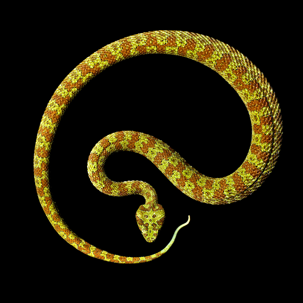
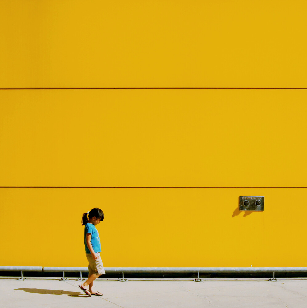
Simplicity in photography is one of the most basic guidelines. In simplicity, the images remain simple. That is to say most of the time, there is one subject in the image and the background is often simple or plain.

Below are 5 examples of photos that demonstrate the guideline of simplicity. In your given groups, you will answer the following questions on the discussion sheet.

1) What is the subject of the photo?
2) Can you tell where the photo was taken? If so, how do you know?
3) Do you recognize any other guidelines we have mentioned? If so, what are they?

Take your time in observing the images. When you are done, think about what your favorite image is. Why is it your favorite?

1) Edward Weston
https://i.pinimg.com/originals/7b/90/b6/7b90b658b1fed19fc6b1083dadb56c8f.jpg 

2) Edward Steichen
https://i.pinimg.com/originals/41/3e/5c/413e5c282dce7ed089c126f439561a78.jpg 


3) Mark Laita

4) Jianwei Lang
https://www.photocircle.net/us/photos/thumbnails/zoom/1761-Ms.-Little-Sunshine--by-jianwei-yang.jpg

Tuesday, October 10, 2017

Review of the Composition Guidelines

As I am out today, you will go over the guidelines we learned about last week. You are to answer the following questions on your class blog, under the post title "Composition Guidelines". If you do not have access to your blog, please answer the following questions on a piece of paper and hand it in by the end of class.

  1. What is composition?

  1. How many guidelines are there? List and describe them all

  1. The last slide shows two different viewpoints of the same subject- what would you call these two viewpoints?

  1. Of all of the guidelines, are there any that you particularly like or are familiar with? Explain why you may like them.

  1. What about any that you do not like? Explain why.

  1. What guideline(s) have we already used in our last project?