The world is full of objects which make perfect natural frames, such as trees, archways and holes. By placing these around the edge of the composition you help to isolate the main subject from the outside world. The result is a more focused image which draws your eye naturally to the main point of interest.


Cropping/Filling the Image
Cropping is the removal of the outer parts of an image to improve framing and accentuate subject matter.


Some things to think about when cropping...
1) Leave out unnecessary details
The bit of yellow balloon that appears in this photo is awfully distracting. Cropping it out redirects focus to the subject.
2) Don’t cut off limbs at the joint
Cropping out your subject’s limbs or hands creates an awkward look.
3) Don’t accidentally crop out the horizon
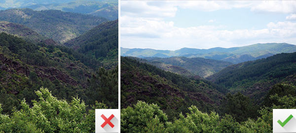
When taking a photo of a landscape, be careful not to crop out the horizon
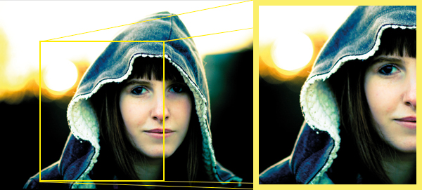
4) The tighter the cropping, the bigger the drama
Crop closer to a subject to highlight details and emotions.
5) Just take a little off the top
A little cropping can go a long way. Be careful to use moderation.
6) Don’t be afraid to experiment
Cropping in unusual ways can create some very cool results.
_________________________________________________________________________
Homework: Take 4 pictures of framing and 4 pictures of cropping. Try to have all of the pictures that you have taken ready to show on Thursday.
Pd 2- All images due on Monday 11/4!!


